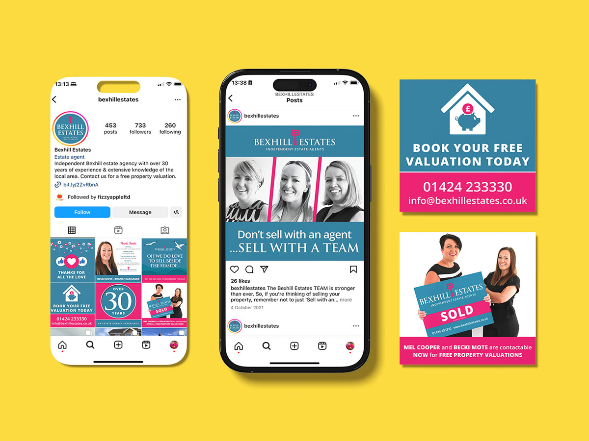
Unveiling Bexhill Estates’ Dynamic Marketing Campaign
The Brief
Facing stiff competition in the real estate market, Bexhill Estates sought a brand identity that would set them apart while resonating with their target market. Our aim was to create a brand that would not only stand out but also reflect their heritage and values.
The Concept
Our creative process delved into the essence of Bexhill Estates’ vision, blending classic sophistication with a touch of modernity. We meticulously crafted six logo designs, incorporating key elements such as house icons and speech bubbles, with the suggested slogan, “Let’s talk about property,” provided by Bexhill Estates. We explored various iterations of logo marks, focusing on the incorporation of a prominent B & E key symbol to emphasise the agency’s identity. The Trajan Pro font was chosen for its timeless elegance, complemented by the contemporary simplicity of the Open Sans font. The selected colour palette of deep magenta and cerulean was carefully curated to convey professionalism and catch attention.
The Delivery
Through collaborative feedback and iterative design cycles, we refined the chosen logo design to perfection, offering Bexhill Estates a plethora of colour and font options. The finalised brand elements, including the distinctive logomark and font pairing, were seamlessly integrated into their marketing collateral, signage, and for sale boards. This cohesive brand identity not only speaks to Bexhill Estates’ longstanding legacy but also positions them as a forward-looking and reputable choice in the competitive real estate market.